News
How To Plan For Your Website Redesign – Step 3: Brand, Messages, and Customer Experience
Following on from the second article in this series, Step 2: Goals, Create a Sitemap, and Plan Your Content, once you have set budgets, defined your goals and planed your content, you will need to know what the next step is.
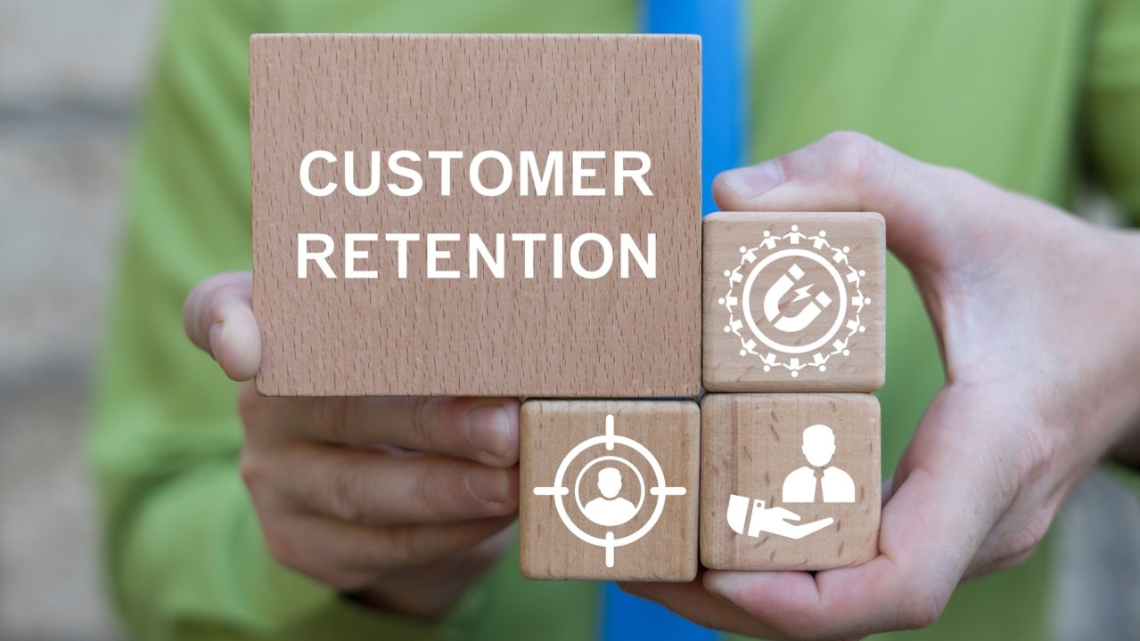
This next step of your redesign process is all about the brand, messaging, and customer experience. Your website is like the online storefront of your business. This is also how you can improve your SEO to get better rankings on search engines.
People judge your business based on your website, so it is important to take each of these steps and carefully consider how valuable it can be for your website. Here you will learn all about this step of your website redesign.
The first two parts of this step are looking at the brand and messaging. Your website needs to properly represent your brand identity and give your customers the message you want them to receive about your company. Since most people online will check out a company’s website before working with them, it is essential that your brand identity and messaging are front and center on your website. This can positively impact your brand’s perception and give you a high level of authority on the products and services that you sell.
Think about it this way. If you go into a store and everything is all messed up and unorganised, you may not want to do business with that company. But if you go into a location where the brand is represented, and everything is organised perfectly, you will have a more positive experience with company.
This brings us to the next point: customer experience. You want to ensure that your customers have a positive experience with your website. There are a few different ways that your website can impact the customer experience. If a website takes longer than a few seconds to load, customers will leave your website. People do not have the patience to wait longer than that, and they will move onto a competition’s website to get the same products and services. It is crucial for your bottom line that you optimize your website for both mobile and desktop users, which will increase your sales.
You also want to ensure that your website is aesthetically appealing to customers. This means that the website not only needs to look good, but it needs to be organized in a proper fashion. Avoid making the webpage too busy or put colors that are too loud on the website. This can be distracting to users, which will also make them leave your website quickly.
The point is to keep your customers on your website as long as possible to increase your sales. The only way that this is possible is by focusing on your customer’s experience when redesigning your website.
A well-designed website makes the difference in a successful company and one that is failing can often come down to its website. This is the first impression that customers often get of your business, so it is important that while you are redesigning your website that you create something that will be appealing to your customers. You want to advertise your brand with your website as well as offer information about who you are as a company.
If you missed the previous articles take a look at – Step 1: Set Budgets, Timescales, Milestones And Responsibilities or Step 2: Goals, Create a Sitemap, and Plan Your Content.


The Ultimate Social Media Guide
With the ever-growing power of social media, we use the latest techniques, video, and animation software to craft eye-catching social media assets that make your brand pop. Our designers, wielding Adobe Creative tools, create distinctive animations and graphics to illuminate your brand story and highlight your products or services. Want a unique design? No problem – we also offer bespoke designs to match your brand aesthetic.